Table of Contents
Gauges
“Gauges” are meters or bar graphs. Most can contain current values for several Units/Databases. The value displayed is always the current value of the Units and cannot be set to be a historical value. Any update or change from any of the displayed Units will result in the gauge being updated a few moments later and sent to any XTension view or Web Interface that may be displaying them.
All your Gauges and Graphs can be opened inside of XTdb from the Graphs menu. (yes the Gauges are there too even though it says Graphs). To edit an existing Gauge or Graph open the display window and select “Edit Graph” from the top of the Graph menu. That will open the Edit Gauge, or edit Graph window.
To delete a Gauge open the display window and then select “Delete” from the Edit menu.
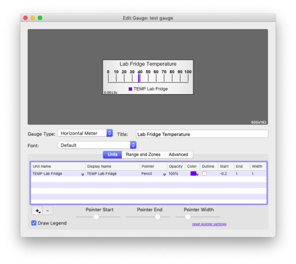
To create a new Gauge select “New Gauge” from the File menu. Enter a unique name for the gauge and you’ll be ready to do some setup. The top portion of the display is the preview of the Gauge with your current settings and it will be empty until you add a Unit so that it has some value to start displaying. In this case I have added the temperature sensor in my office fridge.
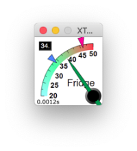
Gauge Type: There are 12 different types of meter/gauge you can create. Some have different capabilities or settings than others. For those with special setup the “Advanced” tab below will be populated with that extra information. Each gauge type will get an entry below in this page but the types are: Horizontal Meter, Vertical Meter, Horizontal Bar Graph (which is not fully fleshed out yet and just renders as another horizontal meter at the moment), Semicircular Meter, Vertical Bars, Full Circle Meter, Round Meter, 4 types of square meter, each with the pointer coming from a different corner, and the Wide Meter.
Title: The title of the graph as displayed defaults to the same name you gave the graph but this may not be the best for rendering in the graph. It may not fit or may contain prefixes or something you use in your naming convention that you do not need to display on the gauge itself. In the screen shot I named my gauge “Test Gauge” but changed the title to “Lab Fridge Temperature” in the menus and any selection dialog in XTension the name will be “test gauge” but the title is what will be actually drawn onto the graph. You can also leave this blank.
If you wish to edit the actual name of the gauge just open the display window and use the “Rename” menu from the File menu.
Font: If you wish this gauge to use a different font than the default you can select it here.
Draw Legend: all Gauges and Graphs have the option of showing a color swatch of the pointer or graph line and showing you what unit is being displayed by that color. If you wish to leave out this legend you can uncheck this checkbox.
Managing Units In The Gauge
To add a Unit to the Gauge use the “+” button and select the Unit from the popup. As soon as a single Unit is added the selected Gauge type can begin to display. This will add the unit to the Units tab of the listbox. If you wish to swap this for a different Unit you can click on the triangle to the bottom right in the Unit Name column and the same Unit list will popup allowing you to select a different unit.
Display Name: The Display Name column contains the label you wish to display for the Unit. It defaults to the Unit name but perhaps I don’t want to use the entire “TEMP Lab Fridge” label but only “Lab Fridge” you can click in this field and edit the label that will be used for this Unit. If you leave the field empty then the Unit will not be included in the Legend but will still be drawn in the Gauge.
You can also use a few tags in this field to insert other information. If you include the <value> tag that will be replaced with the current value of the Unit and the <label> tag will be replaced with the value label of the Unit as set in the Display tab of the Edit Unit dialog in XTension. For a temperature you may wish to do something like “Lab Fridge <value>°F” which would render in the legend as “Lab Fridge 32°F“
Pointer: There are several pointer types that you can choose from. These may be different or limited on different Gauge types but the default list available is: Diamond, Fancy Triangle, Triangle, Fancy Arrow, Arrow, Line, Fancy Line, and Pencil. Each can be further customized with the start/end/width values and sliders at the bottom of the list. More on that below.
Opacity: It sometimes makes sense to draw a pointer without being fully opaque if you want to be able to see where one overlaps another or want to be able to read the labels, values or legend through it. Clicking on this field brings up a popup with many percent opacity values to choose from. The color swatch used in the Legend is also drawn with the same opacity so that it will continue to reflect what you’re actually seeing rather than the color it would be if it was fully opaque.
Color: Clicking this brings up the standard system color selection dialog. The program will assign a default color when you add a Unit based on the number of Units in the list and you can use that or change it to be whatever you choose.
Outline: Some pointer and Gauge types have the ability to draw a black outline around the pointer. The Opacity setting does not apply to the outline so it can help you see pointers in complex Gauges without losing the ability to see behind and through them.
Pointer Settings:
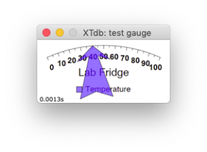
The next 3 entries are used for customising the pointer. I have also changed the graph type to “Wide Meter” You can click and enter numbers in the pointer fields or just highlight the Unit in the list and then use the 3 sliders at the bottom for “Pointer Start”, “Pointer End” and “Pointer Width” if you wish to get back to the default setting you can use the link for “reset pointer settings” below the Pointer Width slider.
Not all pointer types or Gauges will support all settings and they may have different effects on different Gauge types.
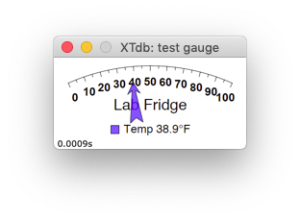
To the left is a ludicrously large arrow pointer. I can adjust the width to make it look more normal. The pointer end will change where the pointy end is pointing on the graph. To the right I have fixed them up and pulled the tip of the arrow back so that it is underneath the value labels on the Gauge rather than over the top of them and shortened it so that it does not cover the legend. I’ve also changed the Display Name so that the actual current value is displayed in the graph legend.
Display More Than One Value!
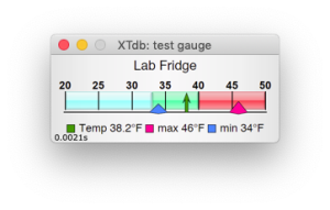
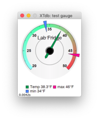
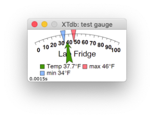 You can display more than one Unit in this Gauge type perhaps you have Units that hold the 24 hour min/max temperatures for the same Fridge (easy to do with XTdb Meta Units in XTension!) Here I have added 2 more units, given them labels that dont take too much room on the Gauge but display the current value and are colored show they are min/max. It is possible to set the pointer start to be ABOVE the line. In this case I did that and set the pointer start to be just below the line but not enough to obscure the value labels. The pointer type for the min/max values is “Fancy triangle” but you can experiment with the others and all the other settings.
Range and Zones:
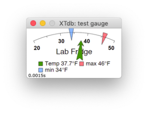 Switch to the Ranges and Zones tab and you’ll see a listbox for creating Zones which we will get to next and 3 fields for Scale start, Scale end and Tick Interval as well as a checkbox that turns on and off drawing the “minor” ticks meaning the ones in between the labeled value ticks on the scale.
It might not make sense to use the default of 0 to 100 when showing a fridge temperature as we are. If the fridge temp goes to 100 or down to 0 we have other problems. Lets set the scale start to be 20 and the scale end to be 50 and that should cover the temperature fluxuations you might see in the fridge. There is no autoscaling for Gauges so you have to chose the values. After doing that our Gauge looks like the Gauge to the right here. It also feels like the value label interval is pretty spread out with a Tick Interval of 10, lets change that to 5 and get some more value labels in there.
Adding A Zone:
You can add colored zones to indicate a danger range or just to illustrate the temperature, XTdb has some default zones you can add. Throughout XTension it can use color mapped to temperature similar to what a weather report page might use with colors being blue when they are cold and working up through oranges to red for very hot. If you are displaying a temperature in an area where people are it can be helpful to insert these zones. To the bottom left of the Zone list box is a “+” button with the popup menu triangle on it and if you click that you can select to add the entire list of temperature colors for either F or C depending on what format the temp you are displaying in is.
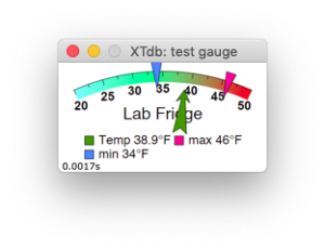 That doesn’t really make sense for us since this is inside a fridge so we will create some zones for ourself. According to our government here in the US the optimal temperature for a fridge is 37°F and should never go above 40°F. So we will create a danger red zone above 40. I also dont want things in the fridge to freeze so I will create another too cold zone starting at say 33° with a green all is well zone in the middle. Use the “+” button without the popup menu triangle to add a new Zone. Set the start to the start of the scale at 20 and the end to 33. Select a light blue color to indicate this is too cold.
Make sure to check the “Smooth Gradient” checkbox and to not check the “Fill Zone” You can experiment with those to see what the effects are on the different Gauge types. After doing that we have a Gauge that looks something like this:
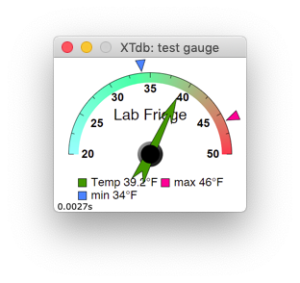
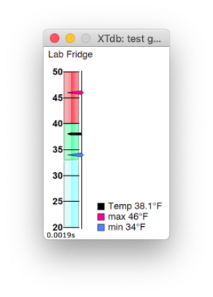
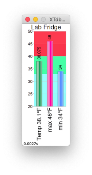
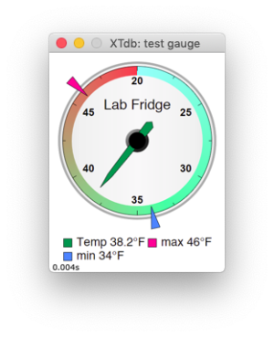
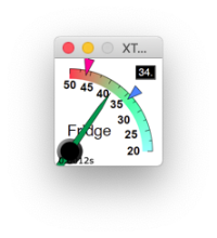
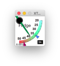
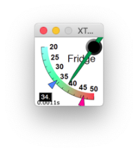
The Wide Meter gauge type does not have any controls on the “Advanced” tab. Here’s what this same data would look like on other Gauge types…

