This is an old revision of the document!
Table of Contents
XTdb: Database and Graphing for XTension
XTdb is a plugin/addon for XTension that provides database functionality. When running it will record all unit value changes and provide for motion reports and graphing of data. The motion reports are available for free but the graphing functionality requires the purchase of a serial number and more information is available at the XTdb homepage
Version 3.5 and newer requires at least build 947 of XTension or newer
Download the latest version XTdb v3.5.4 (build 87) (12/24/2017)
NOTE: OS versions 10.7 and 10.8 require this separate build: XTdb v3.5 (for OSX 10.7)
For OSX 10.13 (High Sierra) at least version 3.5.4 is absolutely required or database corruption will result. Please update your XTdb installation before updating your operating system.
Version 3.5.4
- Fixes a problem were some new units may not have been added to the internal index causing the data to be lost between restarts.
- Includes earlier fixes for High Sierra database corruption problem.
Whats New in 3.5
- Mouse Over display of data points in graph displays. The same data will be displayed in the full sized graph popup in XTension views as well as in the full sized graph popup in the XTension Web Interface.
| The Mouseover Display in XTension: |  |
| The Mouseover Display in the Web Interface: |  |
To select which data lines you wish to have show up in the mouseover select the “mouse” checkbox in the edit graph dialog for that data source:

* Retina resolution graphs and gauges. To turn on high resolution graphs turn on the “Create Retina Resolution Graphs” checkbox at the bottom of the XTdb preferences window. Keep in mind that these graphs will take twice as much memory and space and time to transfer to remote web pages and such. If you regularly connected via slow connections you may not want to do this. They do look wonderful though.

- NEW: You can now run simple queries against the database via applescript. See the AppleScript Dictionary entry for the query verb:
query v: returns the data between the 2 dates for the specified unit. If the optional saving to property is supplied then the data will be written to that file in a comma separated value standard format. If the file exists it will be overwritten. If this is used then the verb itself will return the number of records written to the applescript caller instead of the raw data.
If no file specification is included then a “list of lists” is returned. Each data point will return a list of 2 elements, the value and the date. build 897 of XTension or newer]]
For XTension versions prior to build 897 please use [[http://machomeautomation.com/files/xtdb_062.zip|XTdb version 2.2 (build 62)]]
==Vertical and Horizontal Meters==
{{:vertical_meter.png| 


Suitable for multiple units. Each pointer may be configured for color, outline, size, length and style. Displaying the title and legend is optional. You can add colored zones, raise them with a 3D effect, draw them on top of or behind the tick marks, draw with any opacity and also add labels to the zones.
Semicircle Meters


Semicircle meters are also suitable for multiple values. Each pointer is configurable as to start and end point as well as width. There are several pointer styles. In these examples the long pointers are “pencil” and the small triangle points are triangle points with their start and end point adjusted. You can configure colored zones and choose if they will fill to the center of the graph. Zone labels are not supported on circular meters. Drawing the title or the legend is optional.
Full Circle Meter

All the same pointer and zone options of the Semicircle meter but with the data space continuing all the way around. Suitable for things like a wind direction display.
Round Meter

All the same pointer and zone options of the Semicircle meter and the Full Circle Meter, but with a gap at the bottom of the meter for better seeing a start and end point of the range.
Square Meters


Smaller meter types in 4 orientations. All the same display and zone options as the other rounded meters. The last item in the list of units will have it’s value displayed in the value box.
Wide Meter

All the same pointer and zone options as the other rounded meters but with a wider arc section for data display.
Vertical Bar Graph

Useful for showing many values from similar devices at the same time. Supports all the same zone coloring options as the rest of the meters.
Data Graphing


Version 3.4.3 (build 79)
- released 3/12/2016
- fixed a bug where the gauge being edited might not actually show in the edit gauge window as you were making changes to it.
- fixed a bug that could cause a graph display to stick at a previous date if you were looking at 24 hours for a specific date and then changed back to a live 1-hour or 24 hour display.
Version 3.4.2 (build 78)
- released 2/22/2016
- This release is recommended for anyone running any of the builds with the disk caching mechanism.
- removed debug logging that put lots of information about the output from the cache into the XTension log.
- Fixed a bug were after some errors the local caches of the data didn’t update anymore leading to goofy graphs, though no data was ever lost.
- Fixed a bug where the local cache wasn’t invalidated after you removed individual data points in a query window.
- The applescript command to return the raw data of a graph for the legacy X2Web interface should be working again. I do not have a system setup with that anymore to test with so please let me know if any problems remain.
- Moving the database to or from a separate volume now works properly when done from the preferences window.
- the Duty Cycle applescript verb will never return a number less than 0 or greater than 100 even if there is no data or if the data is goofy.
- Implemented type ahead support for the database window. To get to the unit you’re interested in just start typing it’s name and the list will select the first matching line.
Version 3.4.1 (build 77)
- released 2/12/2016
- bug fix and stability release.
- Anyone running version 3.4 should update to this as it increases stability and data display reliability while continuing to optimize drawing and get the graphs updated even faster.
- All the scary reports of error messages to the mailing list were because of problems dealing with files that were completely empty. This is now fixed.
- There may still occasionally be informational lines in the XTension log. As long as it doesn’t specifically say that there has been an “exception” or the graphs are not updating properly they are nothing to worry about and are only important if something isn’t displaying properly.
Version 3.3 (build 75)
- released 2/1/2016
- Added an “Open existing” and a “Show In Finder” button to the preferences page so that you can more easily move your database to a new location and then select it there.
- Fractional values for graph ranges are now remembered properly and used. Previously they would always have been truncated to integers. You can now create graphs that range from 4.5 to 4.7 if you need to.
- Added “duplicate” menu item. You can now create a new graph with all the same settings as an existing one to work on.
- Enabled the “copy” menu item for the graph window. Places the PNG version of the graph onto the clipboard.
- Improvements in the initial loading of the program. A cache of file state and data is saved at close and reloaded upon launch. You don’t see an improvement the first time you launch the program but subsequent launches after a proper shutdown will take only fractions of a second.
- New index search methodology improves speed of finding of the data in the database by about 100x. This was never slow enough to be a problem but it’s now greatly improved and the supporting of much larger databases should be easier even on relatively slow machines with busy disk drives.
- New Disk Cache of recently used data. Most recently used index nodes of data are now cached in memory and loaded in larger chunks. The disk cache can be turned off and on in the preferences and it’s size adjusted in case you’re short on memory. Since most graphs are currently “live” only interested in redrawing the last hour or the last 24 hours the build in disk cache of the system keeps that moving very fast, but as we move towards doing longer term graphs the disk cache will keep them from bogging things down. If you turn the cache off right now you won’t notice much difference because the system caches is good at keeping that much data in it’s memory, but going forward this is going to be important. Motion reports also take advantage of the new disk cache mechanism.
- “live” graphs can keep their cached queries in sync with new data being received meaning that depending on the type of graph being requested to redraw a graph may not need to access even the disk cache at all to redraw itself. This makes the largest difference in speed at this time to all of the improvements in this build. On my machine a 24 hour graph with 36k data points took almost a second and a half to re-draw previously to this improvement and now happens in around a quarter of a second. This improvement will have the biggest impact right now.
- Added to the preferences window a checkbox for drawing the time it takes to draw a graph on the graph for comparisons sake. It will draw a string like this at the very bottom of the graph if turned on: “0.0385s [*1125r 1ms 19ms][*1660r 1ms 9ms][73r 121ms 1231ms] 2857” the first number is the measurement in seconds that it took to query, load and render the entire graph. If the disk cache is turned off this number will be inside parenthesis. The next blocks are one for each line of data in the graph in order. If there is an asterisk then the local data cache was able to be used and no new query of the data was necessary. The next number is the number of records that were loaded for that line. The next 2 entries are timing values in MICROseconds (not milliseconds, so 1000 of them would be 1 millisecond and a thousand of those make up a second) The first entry is how long the index search took to locate the offset of the requested data, the second is how long it took to actually read the data from the disk or disk cache. At the end of the row is a count of the total records processed. When the local data cache can be used the index search time should be almost nothing, there will still be some time spent processing the local data cache for that graph, but it will also be very small. Certain query types like the binary types make changes to the data in order to display it properly and therefore the local data cache cannot be used for those types.
- All graph rendering and query handling are now done fully threaded. This means that the UI will stay responsive even if you just opened a web page or view that is asking for dozens of graphs to be rendered. It also means that the graphs can be updated more frequently for live display. You may see the updates on a view or web page within half a second rather than within 5 seconds as it was previously.
- NOTE: No database file formats were changed for this release. If the new caching mechanism or index search routines cause trouble in your displays you can return to the previous build by just replacing the app file. If you see a problem anywhere please let me know via email.
Version 3.1 (build 71)
- Refactoring of the interface to Graph layout. The new interface breaks the settings up onto a page panel control to leave more room for more controls and options in the future while making more room to view the graph you are laying out.
- Added “Zone” support to regular graphs. Now like the gauge controls you can create colored zones behind graph data
- Added “Mark” support to graphs. On the Zone page you can now add a “Mark” from the special add button menu (the lower of the + buttons where you can also add color temperature zone presets for F and C temp) A mark will draw a line of the selected color across the entire graph at the “start” value (end value is ignored for marks) you can add a label for a mark that will be displayed in the Y axis. Marks display with an M in the first column of the Zones listbox.
- Limitations at this moment are that a Mark can only be added to the primary Y Axis and that spacing gets a little confused if you have a primary axis, a primary axis title and binary elements.
- More options on the Vertical Bar Graph gauge. You can now display the value of each bar above the bar.
- If you have the bars set too skinny to display it horizontally it can be rotated to the vertical.
- you can add a suffix or unit to be added to the end of this label. These 3 features are on the Advanced panel.
Version 3.1 (build 70)
- The app is now fully code signed.
- On/Off graph marks no longer affect the auto-ranging of a data axis though they must still be assigned to one or the other data axis.
Version 3.1 (build 69)
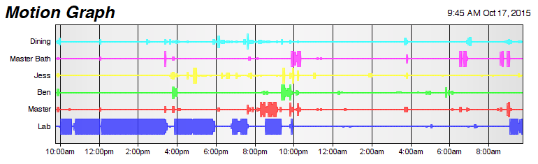
- NEW: binary plot type “Logic Centered” just like the Logic Filled graph except the line that connects the filled portions is drawn in the middle. Here is the motion report example from below but drawn with the new logic filled in the center type graphs:
- NEW binary plot type “Logic Motion” draws similar to the logic centered type except that the height of the graph depends on the number of hits within a given 5 minute period. Each bar on the graph is 5 minutes and gives a graphic representation of approximately how many motion hits there were during that 5 minute period. In this way it’s similar to the motion reports in the XTension and Web Remote interfaces. In those cases the color of the bars changes, in this case the bar grows. Here’s the same graph drawn with the new logic motion binary plot type:
- NEW: placing the tag <value> in a display name field causes it to be filled in with the current value of the unit when the graph or gauge is created. For example you can create a Legend like this:
- By entering something like this in the display name field for the unit:
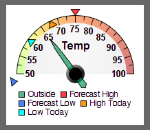
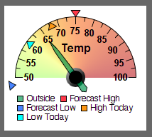
- NEW: Smooth Zone Coloring. Added the option to smooth the zone colors. This is currently only enabled for the angular meter types and not the linear ones. That makes the temperature gauge example look like this:
- since as a smooth gradient you cannot extend just 1 zone to the center with the Fill Zone checkbox, if any Fill Zone checkboxes are on the entire gradient is carried to the middle of the graph
- NEW: several sizing options for the Vertical Bar Gauge. Under the advanced tab you can now change the height of the display overall, control the width of the individual bars, and thus the width, and set the percentage of each bar size should be the gap between bars, So if you wish to make the bars touch each other you would set that to 0. This lets you create more compact displays if you wish.
- FIX: graph lines in both the regular graph plot types and the binary plot types now clip to the plot area and won’t draw beyond it.


Version 3.1 (build 68)
- All the new gauge types already listed above
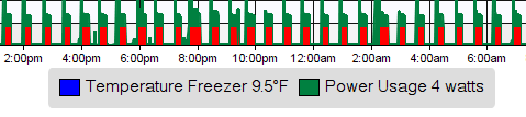
- Added 2 more “binary” plot locations at “0” and “7” these are on the edge of the graph and are therefore clipped to half the width by the plot area however they can be very useful for showing binary data along with mixed value graphs so as to not overwrite so much of the graph otherwise. In this example I am displaying the wattage usage of my fridge along with the internal fridge temperature and the calculated compressor duty at the bottom with a filled when on binary data type.

- FIX: Gauge displays only update when a unit being displayed has a level or status change. They used to redraw every minute like a time dependent live graph has to.
- FIX: Graph and Gauge edit windows will now open in the center of the screen rather than at a document offset down from the display window of the graph or gauge you’re editing.
Version 3.1 (build 67)
10/2/2015
- NEW! In addition to Graphs you can now create “Gauges” with multiple units and many display types. These can be added to views and webpages just like a graph and will be updated live as units change in value. At the moment the most functional gauge is the semicircular meter. The Horizontal Meter may also work OK but is not complete. The other 2 in the popup are not functional and should not be used. There are many more coming now that the basic user interface to creating them is complete. The other types will get fleshed out for the next version and then there will be several more.

By way of example here is a Gauge I’m currently running. The pointers are highly configurable as to where they are and their size. Experiment with the sliders that control their width and start and end points.
- Moves the database from the Library:Preferences folder to the more modern and correct Library:Application Support folder. If you need to go back to a previous version you’ll have to manually drag your XTdb database folder from the new place to the old place and rename it from it’s new simpler “XTdb” name to the original name of “XTdb Database“
- You can now manually select where the database is saved. You can select a custom location in the Preferences window.
- NEW binary graph type “logic filled” fills the on portion of the logic line.
- Less likely to log errors if there is no data for a unit that you’re trying to use in a graph or calculate a duty cycle for.
- All regular graph types now appear in the legend while no binary types will appear in it.
- You can turn the legend on and off if you do not wish it to display at all.
- Lots more tweaking of the layout and size. The graph now resizes automatically and properly for the height of the legend.
Version 3 (build 65) this build requires XTension build 897 or higher.
9/25/2015
- Significant changes to the graph layout engine in preparation for adding an SVG output option in the future.
- Axis titles are now drawn vertically along the axis rather than appended to each axis value label
- Units that are not included in the current XTension connection are drawn with a red indicator ahead of them in the database list.
- Under the Database menu there is a selection to open the manage units not in XTension window. From there you can see all orphaned units and if you wish delete their databases from XTdb. No database unit is ever deleted automatically so they may build up there over time if you make many changes to your XTension database.
- Query result windows will now sort properly by date or value.
- The main database window now opens up sorted by name.
- Smooth Filled graphs no longer draw a black line along the datapoint.
- Binary labels now properly autosize their label spacing, however if you wish you can manually set the width of that portion of the graph so that different graphs line up properly.
- Options to hide the horizontal or vertical lines in the graph.
- all spacing for the different elements is auto-calculated and the graph fills the extra space much more reliably if you dont have a second axis or other features.
- The layout and fonts and such is all a work in progress at this point. If you have comments on the aesthetics to make now is a good time.
- BUG: there are still combinations of options that may make the labels and axis labels overlap. If you see that happening please send me a note with a screenshot and some info on the setup.
- BUG: gant chart style graphs without a line are currently not included in the legend.
- BUG: on/off style graphs are not included in the legend.
- BUG: if an on/off style graph is the only unit assigned to an axis scale it will cause the axis labels to display even though they are meaningless for an on/off style graph.
9/18/2015
- New graph types for discrete ‘binary’ displays. There are now 6 “binary” levels onto which you can embed one of several new discrete or binary data.


- the new graph types can be mixed with regular graph data.
- For a binary graph type any value other than 0 is considered an ON. Except for the HVAC display which has 2 on states. See below.
- The new graph types are:
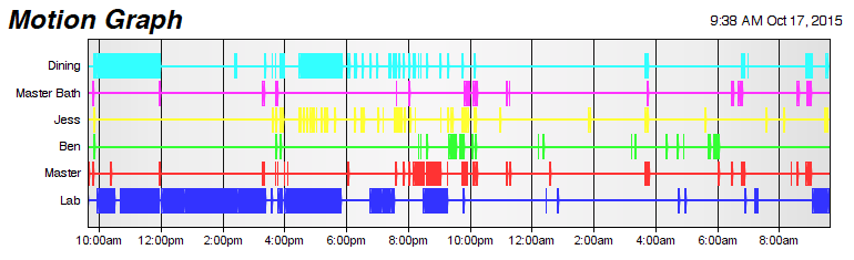
- Motion Report: Ignoring offs this places “dots” at the appropriate time on the graph.
- Motion Report With Line: same as motion report but adds a line along the dots.
- Logic: a square wave display like a logic analyzer.
- Filled when on: draws a box of the selected color when the unit is on. Nothing is drawn during the off periods.
- Filled when off and on: same as filled when on except draws a dark grey, slightly transparent, box when off.
- HVAC status: ignoring the selected color for the data set it draws a red background box when the value of the unit is 1 meaning heat, and a blue background when the value is 2 meaning cool.
- Known issues:
- binary labels do not take into account the presence or absence of a primary scale and they may overwrite each other. Use the secondary axis if this is a problem. Their width calculation is a little flaky too, it may allocate too much or too little space.
- When you first select a binary scale the graph type does not yet change to a binary graph type, so the current data is compressed to the bottom of the graph until you select an appropriate binary compatible graph type.
- The motion report with line graph may not carry the line to both ends of the graph but may stop at the first and last motion event.
- FIX: non-binary graphs with dots will no longer show a dot and the beginning and end of the graph unless there is an actual data point at those locations in time.
Version 2.2
8/28/2015
- Return to the original auto ranging calculation which works better.
- Verifying and repairing the database now takes place in a separate thread. The program can continue to run normally during the regular database verify and if a unit needs to have it’s database rebuilt, only that one unit is temporarily disabled. All data points that are sent while the unit is offline are queued up and processed when the rebuild is complete.
- Reaping old data out of the database is now also processed in a separate thread. Only the unit being worked on is temporarily disabled. All new datapoints for that unit will be processed as soon as the database maintenance is complete.
- The duty cycle calculation now properly includes the time to the present if the unit is ON when the calculation is run.
- The date selectors in the unit query window are now system standard and should always show time and date in the proper format for your system settings.
- The unit query window is now loaded threaded, so you can begin to interact with it immediately while it’s still loading data. If you accidentally start a huge query there is also a cancel button to stop the background updating.
- Fixed a bug in the unit query window that would leave off the very first unit event in the time frame you were interested in.
- The initial loading of the program is now much faster.
- All database maintenance functions, the scan, rebuild and reap, are several times faster than previous and no longer block the interface or the reception of new data or the generating of graphs or reports. Unless the specific unit database is the one being re-written in which case it will delay processing those requests.
- The database window is now easier to get the toolbar popups for editing large selections of units to actually popup.
- Errors and status updates are once again written to the XTension log.
- (build 62) Made a minor update and changed the build number but not the version number. This new version now linked to above fixes a problem where I was being a little overzealous about checking for file permissions when saving graph images. It may have complained that the directory you were writing into was not writable when it actually was. This is now fixed.
Version 2.1
8/25/2015
- faster response and loading on Web Interface pages with several graphs
- app nap now automatically disabled on mavericks or newer systems
Version 2.0
4/19/2015
- brings a completely new commercial graphing engine.
- A new plot type of “on/off” which puts a zone of color behind the other lines, better than using up a whole x axis to display on/off values.
- The transparency of each plot can now be set so that grid lines or other features can show through a filled plot type.
build 055
- adds a minimum and maximum value that will be saved and graphed for each unit. IN order to better and easier filter out analog readings that might have huge excursions due to noise or something. Many temperature sensors can once in a while have a reading of some silly huge number that will throw the graph off otherwise.
Version 1.2
- adds the ability to calculate a duty cycle of a unit over a specific time frame. The new verb in the applescript dictionary is:
set GarageFridgeDutyCycle to (duty cycle of "GARAGE fridge compressor" for 12)
duty cycle of “name of unit” for (number of past hours)
returns a percent. You can run this say every 5 minutes in a scheduled event in XTension to keep a watch on something.
- contains many needed updates internally to display motion reports and share graphs with the new web remote control system.