Table of Contents
Graphs
The main function of XTdb is to provide graphs to be displayed either in the XTdb app or in any of the XTension Views or Web Interfaces. They update dynamically when new data is available for any of the displayed data points within the time range of the graph, or if the graph is a realtime graph as in the last hour or the last 24 hours then it will also update every minute to keep the time display correct. These changes will be pushed to anyone viewing the graph.
All your Gauges and Graphs can be opened in XTdb from the Graphs menu. To edit an existing graph open it from the Graphs menu and then select “Edit Graph” from the top of the Graphs menu, To delete a Graph open the display window as above and select “Delete” from the Edit menu. To change the name of the graph open it’s display window and select “Rename” from the File menu.
To create a new graph select “New Graph” from the File menu. Enter a unique name for the graph and you’ll be presented with the edit graph window ready to add some datapoints to.

Layout Tab:

Title: The Title of the graph is the title as displayed in the rendered graphs upper left hand corner. This defaults to the same as the name you entered for the graph when creating it but you can change it. You may wish to have the name be longer or more descriptive as this is used in the menus and selectors for adding the graph to interface dashboards for example “Internal Temps With HVAC Cycle 24 hour summary” but you may want the graph in the interfaces to simply show “Temperatures.” You can also leave the Title blank and the space that the title woudl normally occupy in the rendered graph will be given back to the graph allowing it to be slightly larger. If you set a title that is different from the name of the graph then the name will show in parans in the Graphs menu to make it easier to find what you’re looking for.
Time Frame: As of this writing the Time Frame is limited to a rolling 24 hour, rolling last hour or to 24 hours for a specific date. This is getting an update with the newer web interface dashboards that are coming in XTension but for the moment you can choose from these options. The default is a 24 hour rolling graph. The Date entry field to the right is used only for the specific date selection and is ignored for the rolling graph types.
Height and Width Popups to select standard sizes for the graphs. Height can be Short or Tall and Width can be “Compressed”, “Medium”, “Long” or “Extended” Due to the arbitrary layout of some elements in the graph it is not currently possible to create a graph with a non-standard size though that could change in the future as well.
Primary Units: and Secondary Units: if these are filled in then the graph is shrunken enough on the corresponding side to draw the text along the scales. If no Units are entered here the space is given back to the graph width.
Font: By default the program default Font is used for labels and titles. You can set this default in the XTdb Preferences window. You can override it for individual graphs to draw with any other graph with this popup.
Draw Horizontal Index: Draw the horizontal lines from the Primary Scale or not.
Draw Vertical Index: Draw the vertical lines from the date/time access along the bottom.
Autoscale Primary: and Autoscale Secondary: If selected the program will chose a scale factor to best display the data. If you wish to limit the scale to a specific range you can unselect these and enter the values to the right in the Start and end fields. This can be quite useful if you wish the primary and secondary to be comparable to each other, or if you wish several different graphs to be comparable. If showing a percent value it is also useful to set the start to 0 and the end to 100 so that the display location makes sense to the eye.
Autosize Binary Labels: Binary labels are drawn horizontally to the right of the graph. Normally these are autosized but they can take up quite a bit of space from the graph so you can limit their size by unchecking this and entering a specific width. If you don’t have any binary data lines in the graph then this is ignored. See more on Binary graph types below.
Draw Legend: Toggle the drawing of the legend underneath the graph. You can also control which units are displayed in the legend in the “Units” tab described below.
Keep Image Updated At: If selected the program will save the graph to a file on disk whenever it would also be updating it for display. This can be useful if other interfaces or programs want to access the graph rendering. Use the save as: popup to set if you wish the graph saved as a png or a jpeg file and the select file button to choose where to save the file and give it it’s name.
Append Date To Filename: If you have selected the Keep Image Updated option above that will constantly overwrite the graph image file as there are updates. If you check this then the date and time will be appended to the graph thereby keeping each version of the graph over time. Useful for creating animations or other similar tasks. Note that no disk space management is done for files saved in this way so it will be up to you to make sure it does not fill up the disk if you choose this.
Units Tab:

To add add Units to the graph use the + popup menu. You can add the same unit to the graph more than once if it would be helpful to display the data in different ways. To remove a Unit from the graph highlight the Unit in the list by clicking on it’s name in the first column and clicking the - button.
You can replace one Unit in the list with another by clicking the popup triangle control at the far right of the Unit column and selecting a new Unit from the popup.
You can change the order that the Unit graphs are drawn over each other by dragging the name of the Unit in the Unit column up or down.
Name In Legend: It is often useful to display a more descriptive or shorter name in the Legend. In the example above my first Unit name is “TEMP porch power supplies” but in the Legend it is simply drawn as “Porch”. If you make this field empty the Unit will not be drawn in the Legend. Some special entries can be used to insert other information. In the example above you can see that the tag “<value>” will be replaced with the current value of the Unit. You can also use “<label>” to display the currently displayed label of the Unit. For example it might be more useful to display “on” or “off” rather than 0 or 1 in this case.
Color: As you add Units XTdb will assign them default colors. Clicking in this field lets you use the standard system color picker to change the color to anything you wish.
Dots: Lets you draw a shape or marker on the graph over the actual data points.  The available dot types are “None”, “Dots” as in the example to the right, “Circle”, “box”, “square” and “triangle” If you have many data points like the blue line in the example it may not make sense to show them, but for fewer actual datapoints it can be useful to see exactly when they occurred. Note that drawing the line or plot is separate from drawing dots. You may have the plot set to None and still show dots as in this example:
Scale: Which scale would you like to use for this data. The Primary scale is to the left and the Secondary scale is to the right. This is also where you could assign a Unit to one of the Binary display types. As of this writing there are 8 positions available for these alternate graph types. See the section below on Binary Graph Types.
Plot: The type of Plot to use for displaying the data. There are different types available for the regular scales and the Binary graph types. The popup will show different possibilities depending on your selection of Scale. These are the Primary and Secondary scale types, see the section below for more information on the Binary Graph types.
- Smooth: As shown in the example. A smooth line drawn through the datapoints and the default.
- Discrete: The line will be drawn as a straight line from one data point to the next and then move to the new value. For example:
- Smooth Filled and Discrete Filled: The same graph type as above but filled in to the bottom of the graph.
- On/Off: Drawn as a field the entire height of the graph when the Unit’s value is more than 0 or not drawn at all if the value is 0. Place in the back or use the opacity to let the other lines or the background show through a bit. In this example the power usage of my garage fridge is used to decide if the compressor is running or not in order to calculate a duty cycle:
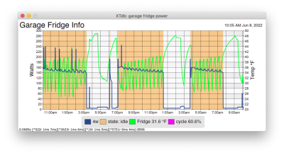
- None: No lines will be drawn for this graph. In the above example the duty cycle is set to None yet it is still showing it’s value in the Legend. See also the Dots section above as you can still draw the dots or other graphics at the data points even if there is no line drawn.


Opacity: It is often useful for one line or graph element not to eclipse entirely the others behind it or the background lines. You can reduce the opacity of any Unit element by selecting something from this popup other than the default of 100%.
Mouse Over Data: If you check this checkbox then when you mouse over the graph in any of the XTension displays it will draw a line with the exact time of that datapoint as well as overlay the values onto the graph. This way you can see exactly what the values were at a specific time.

Zones Tab:
 Using the Zones tab you can create colored zones or labeled marks on the graph. To display temperatures with standard weatherman colors you can use the + button with the popup menu triangle to select from the standards for C or F. To add a “red zone” for temperature or some other indication you can use the non popup menu version of the plus button above that. You can also use the “Add Mark” selection of the popup menu plus button to add a “mark” or a labeled line at a certain value “exhaust fan starts” or “CPU throttleing begins” for a mark you can use the Mark Label and Label Color to setup how that is displayed in the graph.
Binary Graph Types:
In addition to the standard graph lines XTdb provides what it calls “Binary” graph types to better visualize other data types. There are 8 Binary graph plot positions in each graph and you can select one for a Unit. These will draw over the existing data and can be mixed with any other graph type. They do not use the primary or secondary scale as they aren’t used to display analog readings, but binary states or events. In this example the duty cycles of various HVAC, Water Heater and Refidgerators are displayed: 
In that case all 8 lines are setup as “filled both off and on” type so that the grey background is shown when not on and their color is shown when not 0.
Here you can see a graph of my refidgerators with regular data mixed with 2 binary lines at the top and bottom showing the duty cycle as the graph shows the temperature and power usage.
Binary Plot Types:
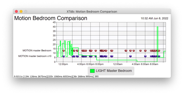
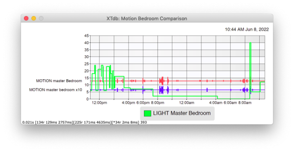
- Motion Report (ignores offs, use with dots) Make sure that you select a dots type from the dots column for this display to show anything. In this example the output from 2 different motion sensors are compared along with the lux reading from another sensor.
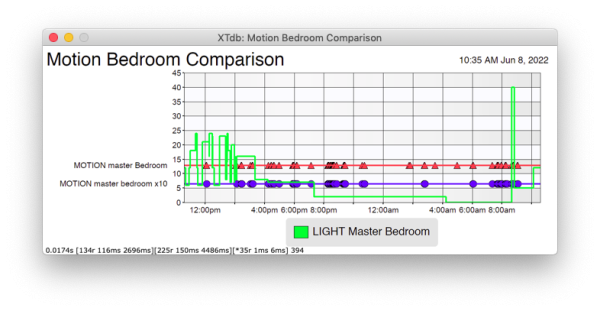
- Motion Report With Line (ignores offs, use with dots) The same graph but now with a line connecting the dots as well as some different dot types for examples.
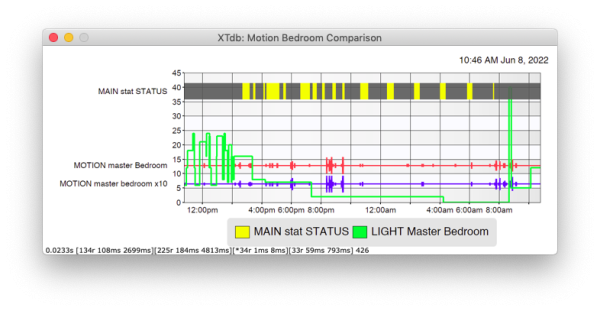
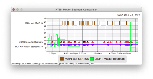
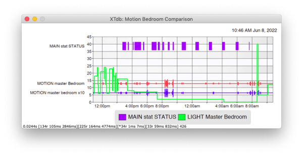
- Logic: A “logic probe” style graph drawn as a discrete graph with only 2 states. Here you see it in the Main stat STATUS overlayed with the previous examples:
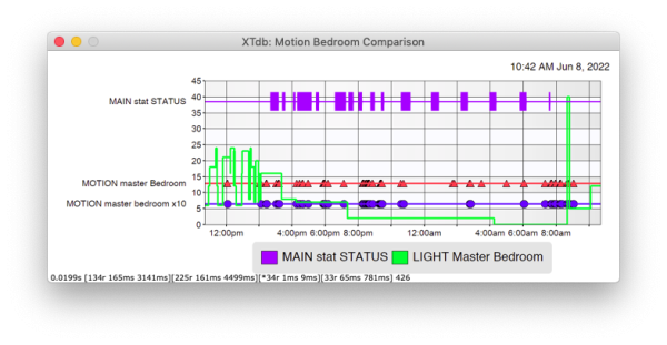
- Logic Filled: Same display as logic but drawn as a filled discrete graph line instead.

- Logic Centered: Same as logic filled but with the line drawn through the middle of the graph.
- Logic Motion: A special form of the Logic Centered where the height of the line corresponds to the number of On events received in each 5 minute interval. In this case both motion graphs show tiny ticks when a single motion hit occurrs and larger ticks as the activity in the time period increases.
- Filled When ON: Draws a box across it’s line when the value is On:
- Filled Both ON and OFF: The same as the Filled When ON above but also draws a slightly translucent background during the off times.